Matching prom dresses can look cute… or it can look like a team uniform. If your friend group wants to look coordinated in photos without wearing the same exact dress, you’re in the sweet spot.
This guide gives you easy rules for planning group prom outfits that look intentional, photograph beautifully, and still let everyone choose a dress that fits their own vibe.
Rule #1: Pick a color story, not a single color
Instead of “Everyone wear blue,” choose a palette. Palettes give you flexibility and keep the group cohesive.
Easy prom color palettes that always work
- Jewel tones: emerald, burgundy, navy, plum
- Soft pastels: lavender, blush, dusty blue, sage
- Metallic neutrals: champagne, gold, silver, rose gold
- Classic + bold: black + one accent color (red, emerald, cobalt)
Pro tip: Choose 3–5 colors max. More than that looks random.
Rule #2: Choose one “anchor color”
An anchor color is the shade that shows up the most across the group. Everyone doesn’t need to wear it, but it ties the photos together.
Examples:
- Anchor: sage → add dusty blue, champagne, blush
- Anchor: navy → add silver, emerald, burgundy
- Anchor: lavender → add blush, pale blue, soft gold
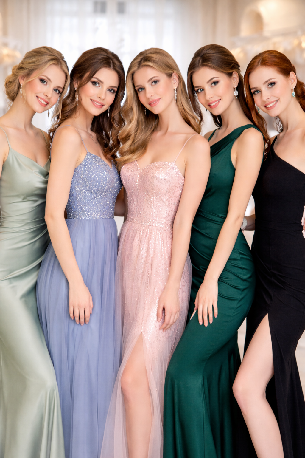
Rule #3: Keep color intensity consistent
This is the part people miss. The problem isn’t “different colors.” The problem is mixing super bright with soft muted.
Try to keep everyone in the same “volume”:
- all soft/muted (sage, dusty blue, blush)
- or all bold/rich (emerald, burgundy, cobalt)
If one person shows up in neon pink and everyone else is in dusty pastels, the photos will feel unbalanced.
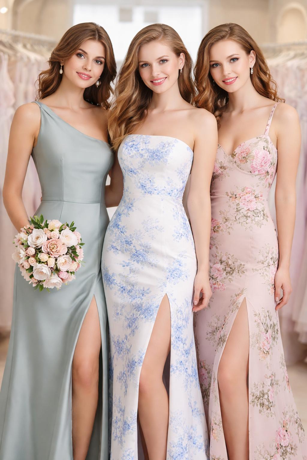
Rule #4: Mix silhouettes, not vibes
You can absolutely mix styles—A-line, slip, mermaid, fitted gowns—as long as the overall vibe feels like the same event.
Pick one vibe:
- Classic glam
- soft romantic
- sleek minimalist
- sparkle party
- old-Hollywood
Then let everyone choose the silhouette that makes them feel confident.
Example: If the vibe is “classic glam,” one friend can wear a satin slip, another a structured corset gown, another an A-line—still cohesive.
Rule #5: Decide your sparkle level as a group
Sparkle is the quickest way for a group to look “unmatched” even when colors coordinate.
Choose one:
- All matte (satin/crepe/chiffon)
- Some shimmer (subtle glitter tulle, light beading)
- Full sparkle (sequins, rhinestones, glitter)
A mixed sparkle level can work, but aim for balance:
- 1–2 sparkle dresses max in a group of 5–6
- or everyone wears some shimmer, even if subtle
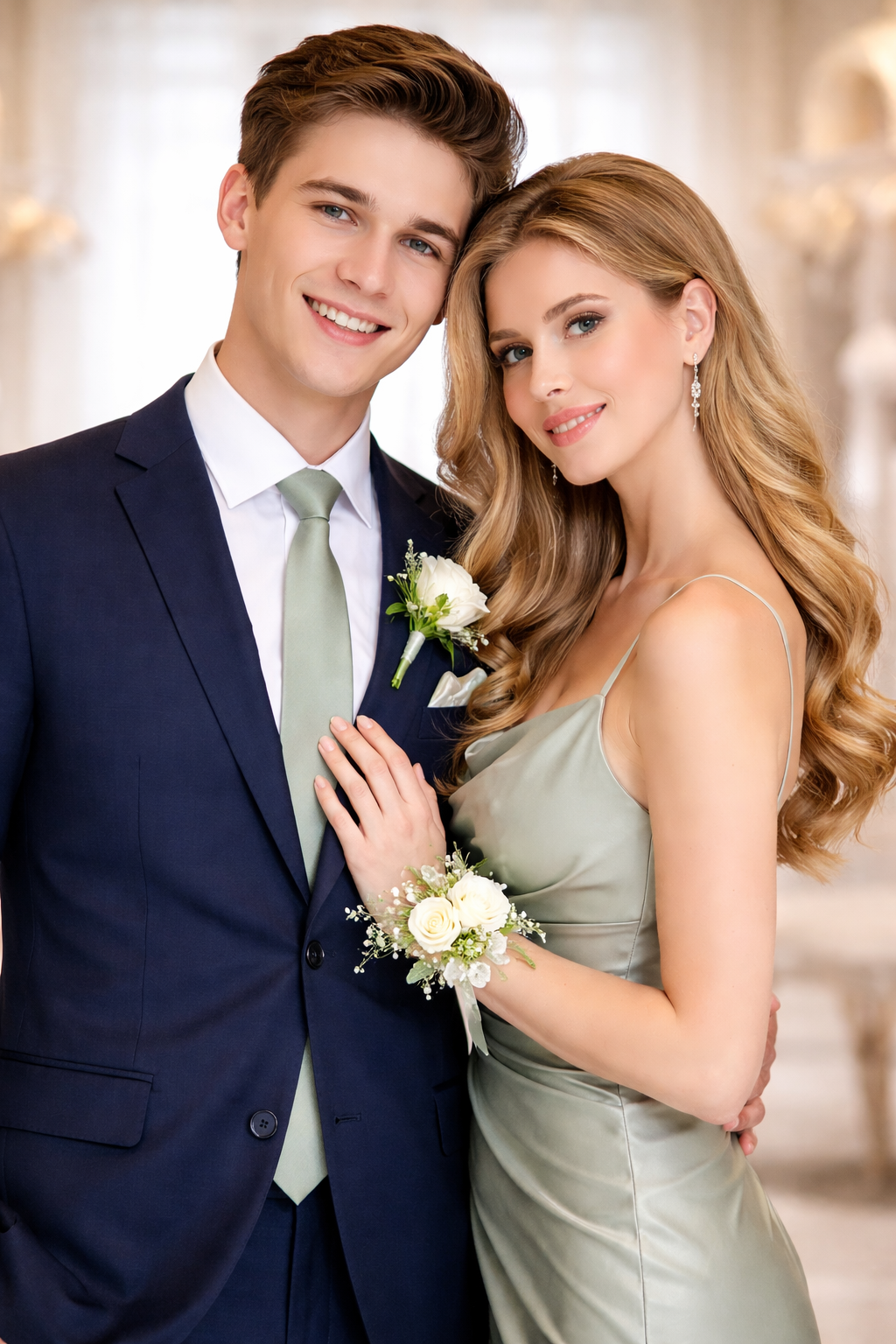
Rule #6: Use “connectors” to tie the group together
Connectors are small details everyone can share without matching dresses.
Easy connectors that look great in photos
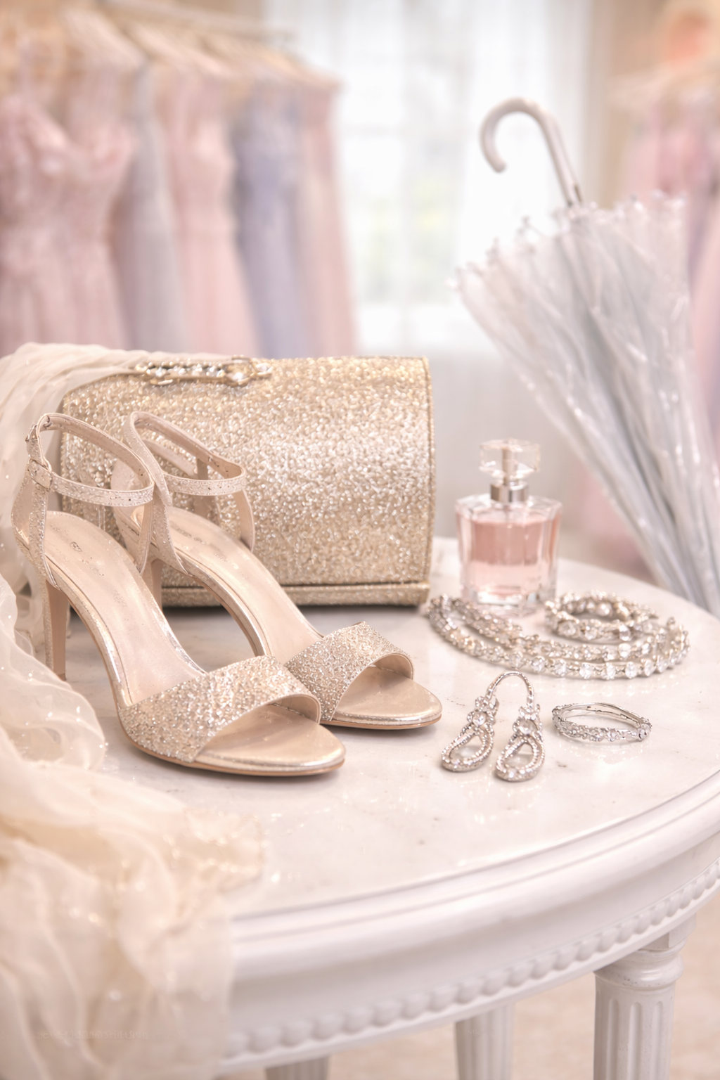
- metal tone: everyone wears silver jewelry OR gold jewelry
- shoe color family: nude, metallic, or black
- hair vibe: all sleek (pony/bun) or all soft waves
- accessory theme: rhinestone earrings, pearl accents, or simple minimalist jewelry
- bouquet/corsage color: same floral palette (even if dresses differ)
Connectors are a cheat code for looking coordinated with zero stress.
Rule #7: Plan for photos (because prom is basically a photoshoot)
If your group wants photos that look cohesive, you need to think about:
Lighting
Indoor flash + outdoor dusk can change colors.
- Best photo colors: emerald, navy, burgundy, dusty blue, silver
- Trickier colors: super pale nude, neon, very light pastels (unless textured)
Background
If you’ll take photos outdoors (Northern Michigan = likely), avoid colors that blend into the scenery:
- If it’s spring and everything is green, maybe skip olive for everyone.
- If it’s snowy or bright, jewel tones and metallics pop.
3 easy prom group formulas (copy/paste these)
Formula A: The “Pastel Mix” (soft and trending)
- Sage + dusty blue + blush + lavender + champagne
Works great for romantic styles and garden vibes.
Formula B: The “Jewel Tone Lineup” (bold, photo-friendly)
- Emerald + burgundy + navy + plum + silver
Looks expensive in photos and works with any silhouette.
Formula C: The “Neutrals + One Statement” (simple but strong)
- Black dresses + one accent color (red, emerald, cobalt)
Clean, coordinated, and impossible to mess up.
What if someone hates the group palette?
It happens. Here’s how to handle it without drama:
- Let them choose a dress they love.
- Bring them into the group with connectors (jewelry metal + shoes + corsage color).
- Keep their shade within the same intensity level (muted vs bold).
Nobody should wear a color that makes them feel awful just for photos.
Quick group checklist (send this to your friends)
Before anyone buys a dress:
- ✅ choose palette (3–5 colors)
- ✅ pick anchor color
- ✅ decide sparkle level
- ✅ pick one connector (silver vs gold, shoe color, etc.)
- ✅ confirm photo setting (indoor/ outdoor/ both)
That’s it. You’ll look coordinated without matching.
Final takeaway
You don’t need matching dresses to look like a prom group. You need a color story, consistent intensity, and one or two shared details. Done right, the photos look cohesive—and everyone still gets to wear what they actually love.